Showing posts sorted by relevance for query chandelier. Sort by date Show all posts

Sunday, October 11, 2009

Chandelier Input Needed.

I need some advice on which chandelier to go with in the dining room. I think part of my problem is that I am not used to the pearson chandelier, so it still looks different/off to me. What do you think?

Here is the chandelier we originally purchased for the dining room:


Here is the new pearson chandelier:


I know I will need to get rid of the lamps on the buffet because it looks to "shady" with the 3 big drum shades in that room. And that is totally fine, I think the lamps will look perfect in our bedroom (with their original white shades). Maybe something like this below without the big lamps. Sorry for the poor lighting (clicking on the picture makes it a little easier to see).


Any thoughts would be greatly appreciated!

Sunday, April 3, 2011

Guild Shop Chandelier.

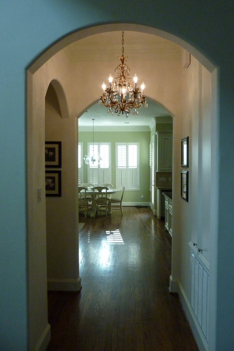
Remember the chandelier from the Guild Shop I previously blogged about here and here?  Justin hung it this weekend!  I originally was going to hang it in our entry way, but after thinking about it some more, decided there may be better places where it would be more visible.  So we cruised around the house looking for other options.  Justin actually came up with the idea to hang it where we did.  And he was totally right -- he's a keeper!  He hung it on our second floor in the little area between our kitchen and dining room (and right outside of the powder room).  Here's the view of it as you get on the second floor.


I love the touch of glam it adds to an otherwise boring hallway.  In case you're curious, that archway over there to the left is where the powder room is.


This is the view from the opposite direction looking into the dining and living room from the kitchen.  If you look closely you can see Justin lounging in the living room admiring his handiwork.  (It's like a game of Where's Waldo without the red stripes and glasses!)  And for the record, our kitchen is not sherbet green -- the lighting wasn't ideal.


We ended up just replacing the candle covers and adding some more crystal prisms (there were quite a few missing).   There's now a mix of the old crystals and new ones, but since I was able to find nearly identical crystals online, you can't tell the difference.


{Side note: see those flowers in the background by the mirror?  I recently went to the dentist to get my first-ever cavity filled and was pretty nervous thanks to a terrible wisdom teeth removal experience.  Justin had a gorgeous bouquet of tulips, hydrangeas, roses and lilies delivered to my office before I went to help calm my nerves.  Super sweet!} 

But back to the chandy . . . as Justin said, "it's pretty baller to have a chandelier in your hallway."  And I couldn't agree more! 


Hope you all had a great weekend!

Sunday, June 14, 2009

Chandelier.

I have been looking for a mini-chandelier to put over our bathtub when we finally get some free time to do some minor renovations.

I came across this beauty tonight:


You've gotta be kidding me! As if the seahorses were not hideous enough on their own, check out the awful lampshades. Did a kindergartner paint those? And then it is like the designer thought the few crystals at the bottom would class it up. Simply amazing. This beauty can be yours for $1,199.91.

I did find the one below that I really like. It is not quite as colorful and expensive as the lovely seahorse chandelier, but it is a touch more glamorous, which is the look I was going for.

Wednesday, June 1, 2011

Kitchen Crush.

I was recently cruising around decorpad and came across a stunning kitchen that was just too good not to share.  It has such a classic sophisticated vintage vibe to it.       


(photos: decorpad)

After seeing those pictures, I really wanted a more straight on picture so I could get more of that awesome chandelier action I saw teasing me in the first couple of pictures.  I hunted around decorpad to no avail and then came across it via my mad googling skills at House of Turquoise.

Here she is in all of her glory.


Wow.  Simple, yet so beautiful.

A few of my favorite parts of the room are the windows, the cabinet color (of course), the hidden appliances, the gold on the stove, the farmhouse sink, the cararra marble, the green crown molding, the faucet, the chandelier (obviously), and the suzani rug.

What's your favorite part?

P.S.  I'm currently in Cincinnati for work.  How can it be 90 degrees here?  I thought I would head north and enjoy some cooler temps!  But on the bright side, at least the humidity is extremely low.  And when I got back to my hotel room tonight (after eating a tasty steak dinner), I had a chocolate chip cookie waiting for me on my nightstand!  

Monday, October 25, 2010

Breakfast Room Light.

I just realized that I hadn't posted updated pictures of our breakfast room with the Calias chandelier from Z Gallerie.  It's been hung for quite some time, but I just thought about it because I sold our previous light fixture on craigslist this past week.  The new chandelier brings just the right amount of glam to the breakfast room!


Also, I'm in the market for a new centerpiece for the table.  Any ideas?  I don't want anything too crazy, but I need something a little more substantial.

Tuesday, August 25, 2009

Chandelier Love.

Recently, I have been eyeing Restoration Hardware's Pearson chandelier:

I love its simplicity plus the little bit of glam with the crystal at the bottom.

I pulled up the webpage about 10 times on Saturday to ogle it. Then, we went to a client's house for dinner that night and she had it in her dining room. I pretty sure that means it's meant to be, doesn't it?

Sunday, July 11, 2010

Kitchen Lighting.

So I have been drooling over the Calais chandelier from Z Gallerie for quite some time now.  We were originally considering it for our sitting room off the master, but we were concerned it would hang too low.  Not one to be deterred, I convinced Justin to try it out in the kitchen.

It's not completely hung yet (we were just testing it out to see how it would look in the space).


The close up:


And what was there before:


What do you think?  The glass chandelier or the pendant?

Tuesday, June 25, 2013

Home Tour: Powder Room.

Yikes.  It's been a while (thanks for your frequent reminders, mom and Ellen).  But let's ignore that and focus instead on the fact that I am finally getting around to showing you our powder room.  Who doesn't love a good before and after?

Basically, the before was a massive snooze-fest.  Complete with a bad brass and chrome faucet, a claw-like light fixture, pale yellow walls, two toilet paper holders (why?), and a toilet and sink that were undersized.  Needless to say, this room didn't do anything for us and needed some major help.   


And here's the after!  Bye bye snooze fest, hello gorgeous (if I do say so myself). 


Absolutely nothing from the old powder room stayed.  I'm all for re-using what we could, but in here, there was nothing worth even working with.  I knew right off the bat I wanted to do some bold wallpaper in this room.  If you can't be bold in the powder room, where can you?    


And for some detail shots . . .

My mom bought this vintage mirror and it was exactly what I was looking for.  She was sweet enough to let me have it for the space.  I love the detailing on the frame and the contrast the dark frame provides in the space. 


The light fixture proved to be more difficult than I thought it should have been.  Probably because I kept envisioning sconces in the space (that wouldn't fit) or a chandelier (which would require us to re-wire).  I also wanted to add a touch of brass in this room via the light, but wanted to keep it simple.  At the end of the day (and lots of searching), this fixture fit the bill. 


I struggled with what to put on the walls for two reasons:  (1) I didn't want anything to compete with the wallpaper; and (2) I was scared to put a hole in the beautiful paper.  I'm happy with my choice to go with simple black frame (that works with the mirror), which has a large white mat to provide some separation between the picture and the wallpaper (and only required 1 tiny hole).  Win, win, win!  The picture itself is one we took of a street in Paris right by one of the hotels we stayed in.    


As a bonus, here's a before shot of the hall that leads to the laundry room and garage with the powder room off of it (the door on the right). 


And here's the after.   You can't tell from the photos, but the wood floor and the handrail were all stained a darker, richer color.  And we replace the ceramic tile in the powder room with some fun black and white mosaic tile.  We still need to paint the laundry room, but that's a subject for a different post.


Oh!  And we added the chandelier in the hallway.  I mean, why not?  Since we didn't want to redo the electrical to put it in the powder room, we did the next best thing . . . we put it right outside the door.  It's actually perfect there.  I love the way it totally glams up the hallway.  Some things just work out.  (In case anyone's curious, the wall color is Benjamin Moore Silver Chain.)


If it's something that would be helpful, I will do a post with the sources.  So what do you think?  Much better, right?        

Tuesday, April 28, 2009

Bathroom Renovation.

I don't really mind our bathroom -- it could be better, but overall I am okay with it (which is saying a lot coming from me). However, it really bothers Justin because as he says "it has so much more potential." It didn't help that my mom (in a very nice way) agreed with him and said she noticed that it wasn't as nice as the rest of the house (or something to that effect).

I understand where they both are coming from, so we took advantage of Restoration Hardware's bath sale. Here is what we are thinking, as of right now:

Remove the massive mirror and replace with 3 framed mirrors (hence, the lovely blue painter's tape above). We purchased these beauties below from RH, but after seeing super cheap mirrors that we could frame out ourselves at Lowe's this weekend, I am motivated to save some money and see how they would turn out. We should be getting the RH mirrors later this week. So we will see. I am also slightly concerned it could look to "mirror-y." I don't want it to look odd with 3 mirrors, but our vanity is 10 feet long, so we really need something more than just 2 large mirrors. Any thoughts?

We also bought 4 scones to go on each end and in between the mirrors (where the painter's tape "hyphens" are). I always love the look of sconces in the bathroom -- very Divine Design-ish. And our bathroom is pretty terrible when it comes to lighting, so the sconces will be perfect.

My mom also sent the picture below as inspiration (thanks, mom!). I love it. They actually framed out a big wall mirror like we have with molding. We are looking into that option too, but could turn out to be just as expensive since it is something we would want a professional to do. But at least it gives me a good idea of the direction we are headed.

(photo: better homes and gardens)

While we are doing all of this in the bathroom, I have also had a change of heart about the paint color. I still like the blue, and it really helps make the bathroom not feel so massive, but I think I would rather have a more calming, spa-like feel. I love the gray color in the picture above (and have been thinking about Benjamin Moore's Silver Fox (gray) for the bedroom).

My special request in the bathroom is a chandelier over the bathtub, which isn't pictured above. I haven't found the perfect one yet. We need something smaller and in a silver/nickel finish with crystals. If you see anything that fits the bill, let me know.

It could be a while for the final product, especially since the sconces are on back order until June, but I will be sure to post pics of the progress and the spa-like after. And don't worry, we plan to leave my favorite part of the bathroom -- the mini-refrigerator.

Tuesday, November 8, 2011

Home Tour: Dining Room.

It's been a while since I did a home tour post -- I know it's shocking, but there's actually more to our home than just the outside, the entryway, the first floor bathroom, and the office.   

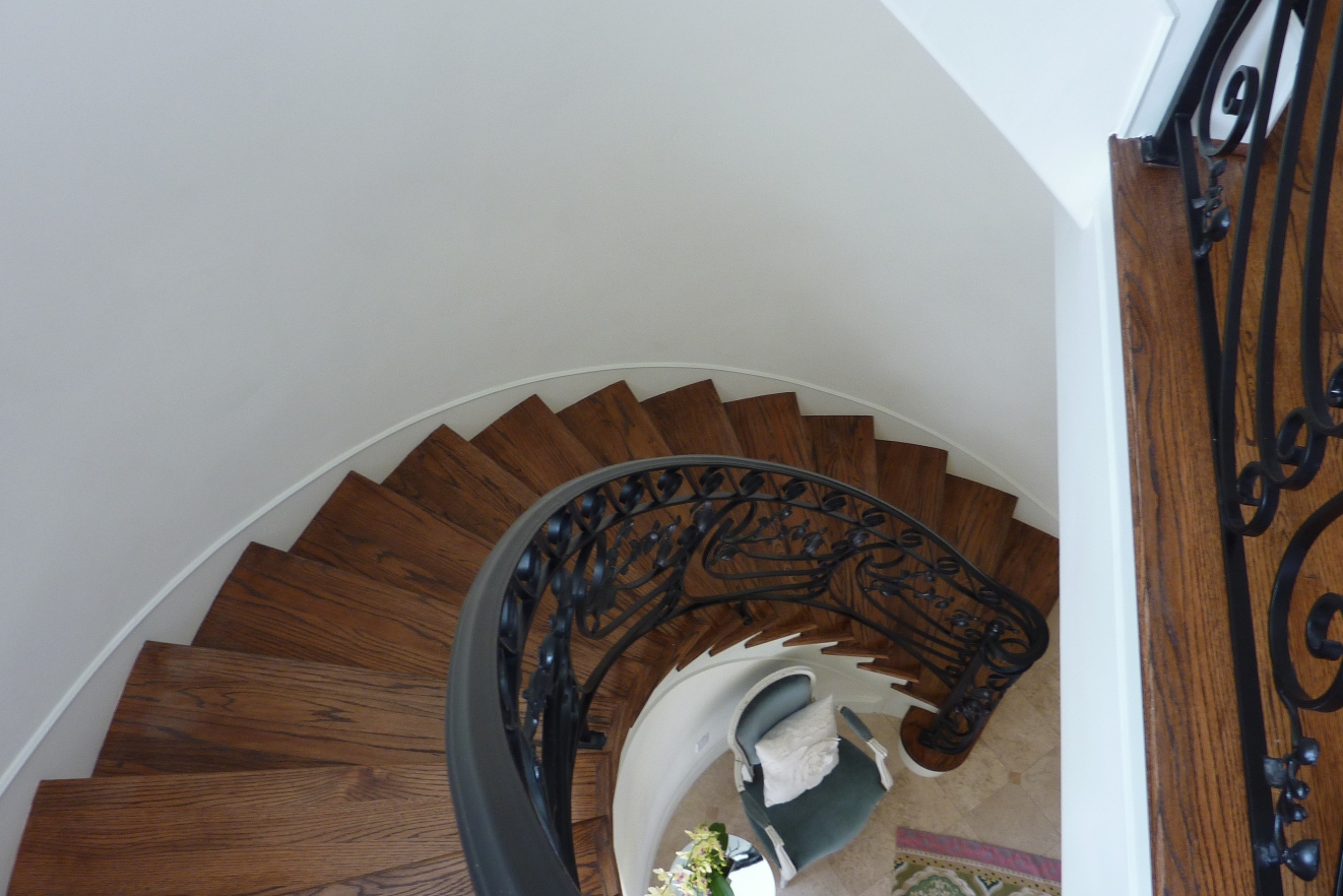
From the entryway post, you can see the staircase.  As you walk up the stairs, this is the view:

(why hello, neighbor's roof)


If you look down, this is what you'd see:


You pretty much walk up into our dining room.


We painted the walls a red in a flat finish, marked off the lines with tape for the stripes, and then did a coat of gloss poly in every other stripe.  The paint in this room is one of the first things people notice and they always love it.  This room was one of the first rooms we painted when we moved in (and one of the few rooms I haven't wanted to repaint . . . yet)! 

As I've mentioned before, I am nosy and am always curious where people get things.  So if you're like me, here's where the big ticket items are from:  the rug, wood table, chairs, buffet, and china cabinet are Pottery Barn; the upholstered chairs are from Ikea; the three large canvas prints are from High Fashion Home; the drum shade chandelier is from Restoration Hardware; the buffet lamps and mirror are from Z Gallerie. 


Here's a better look at the buffet set up.  {Random aside:  I pronounce the word "buffet" as "boo-fay."  I blame it on my mom (who pronounces "turquoise" as "ter-kwaz").  Anyone else out there say boo-fay?  Anyone, no?}


To the right of the mirror, I found this awesome vintage Vogue cover from Etsy.  I wanted something vintage-inspired and this cover had the cool blues from the fabric on the chairs, rug, and table runner and the red from the wall and rug.  And my awesome husband cut a custom mat for it. 


Isn't it perfect for that space? 


So there's the dining room (and as a bonus, you can see a sneak peek of the living room in the mirror in the previous picture).


The kitchen is up next!  And you can (finally) check out the rooms under the House Tour tab above. 

Hope you guys are having a wonderful week.  I am headed out of town for work, but will be back home in time for the weekend!


Monday, April 25, 2011

Eye Candy.

I'm sorting through San Diego pictures, but in the meantime, I thought I would share pictures of some fabulous rooms (and point out one thing I am loving in each room).

This couch = nothing short of fabulous.  The color, the tufting.  Lovely. 


I am generally not a fan of skirted tables (don't know why), but am loving the simple look of this nightstand with the trim.  


This next room just makes me happy.  I couldn't decide which I liked better -- the chandelier or the nightstand . . . or the lucite on the chair.  All of it's amazing! 


I am totally digging the gray with the dark wood tones and the fancy molding above the door in this dining room.


For this bedroom, it's a toss up between the grasscloth wallpaper and the greek key nightstands.

(all photos: decor pad)

So picking out one thing in each room was more difficult than what I thought it would be!