Showing posts with label office. Show all posts

Tuesday, October 25, 2011

Cheap Art - Paris Print.

Back in my office post, I mentioned that we needed something to hang over the daybed. Well, now I can cross that off my list! Check!


I love it for multiple reasons: (1) it's Paris related; and (2) it was done on the cheap.


The "print" is this wrapping paper from Paper Source.  It was a whopping $3.95.  The frame is the Ribba frame from Ikea, which is $24.99.  So for less than $30.00, we got a large piece of art to fill the space (and remind us of our fabulous time in Paris).  Thankfully, the paper fit perfectly in the frame.  The colors work well in the room too.  


This last picture of Riley and Zoey snuggling on my lap was too precious not to share -- and it shows part of the Paris print, so it's somewhat related! 


Hope you're having a wonderful week.  It's flying by for me -- I have a trial on Thursday for a pro bono client that I'm prepping for, and tomorrow is ice cream social day at the office.  Jackpot! 

Monday, August 22, 2011

Home Tour: Office.

In the last home tour post, I showed you the office bathroom. Well, now (finally) here is the office itself!  Our office is definitely a multi-purpose room. We use if for an office (of course) and also as a guest room and home gym. Riley and Zoey stay in this room during the day too.

The room is pretty big -- 20' by 18'. We've really struggled to use the space in the best way. Frankly, it's almost too big. When we first moved in, this room was our main guest room and the office was on the third floor.  We switched them a while back and like this set up much better. This room is still a work in progress (but what room isn't, really?).

To give you the lay of the land first . . . as you walk in, this is what you see over towards the right back corner.


This is the view over on the left side of the room. We definitely want to add another rug and either a comfy chair or a smaller couch for lounging. When we first looked at this house, the first thing I noticed was the terrible light fixture/ceiling fan. Since we bought the house, I've talked about changing it, but as you can see, it hasn't happened yet!


All of my favorite offices have the expedit shelves from Ikea, so I thought why not include them in ours. They really are a great storage solution! I'm still tweaking the styling, but it works for now.


From this picture over on the "daybed side" of the room, you can see where the door from the entryway is. We definitely need to add something above the daybed and over to the left of the TV.  And don't worry -- the exercise bike is on wheels, so we can wheel it out in front of the TV when we use it. We don't torture ourselves by facing the corner while we work out!


And the doorway to the left of the clock is the bathroom and the door in front of the bike is a mini-closet that is under our staircase (just so you get an idea of the whole layout).  


If you keep going around, you see the other corner of the office where the mail center is above the Ikea cabinet I jazzed up.


We each have a bin to keep magazines, ads, etc.  There are also places for receipts, bills, and coupons up on the wall.  It always seems like when I'm running out the door to shop, I know I have reward points or a coupon somewhere and it takes me a good 10 minutes to find where I put it.  Now I know to check here first (assuming the system works correctly).  And it's nice to have the recycle bin handy for all those ads we get! 


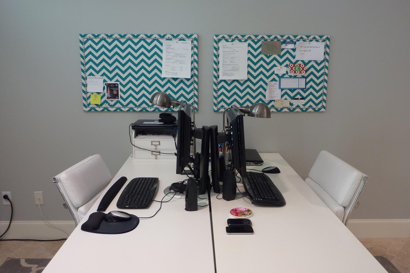
Here's where we work when we're at home, which we both have seemed to be doing a lot of recently. 


I like the desk set up where we are facing each other.  We used to have the desks side by side, facing the wall, but this set up seems to work a little better for us.  Riley and Zoey usually lay down by our feet under the desk.  We can peek around our monitors when we are deep in conversation!  And no matter how hard we try, the wires and cords on the desk always look so messy! 


You can also check out a close up of the chevron boards in action.  The color ties in nicely with the cabinet by the "mail center." 


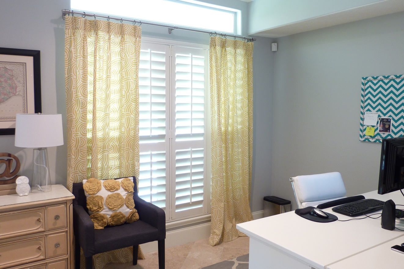
For those of you with an excellent memory (since it was forever ago), you will remember that I was debating what fabric to use for the drapes and roman blinds.  It was a close call, but I ended up going with the theo fabric.  I am happy I went with that choice.   


Tonic Living made the drapes and the blinds.  They were so easy to work with and did an excellent job.  I would definitely recommend them.


I found the dresser on Craigslist.  It isn't staying the yellow color forever, but oddly enough it doesn't seem too out of place.  I hope one day soon to paint it a muted teal color.


And were back around to where we started.  Phew -- that was quite the tour. 


And because it's technically the dogs' room, since they stay here during the day, here they are in the room looking as cute as ever. Excuse the tripod in the back. 


A lot of napping (by people and dogs alike) happens on the daybed.


Thanks for joining me for the grand tour!  That wraps up the first floor.  Now on to the second floor . . .  

{And don't forget to enter the Uprinting canvas giveaway -- it ends today (Monday)!}

Saturday, May 14, 2011

Tiny Break.

I don't know why I haven't mentioned it before, but I am hosting a party for my office this Wednesday to welcome our summer associates.  Needless to say, we are busy around here making sure everything is just perfect.  I am going to sign off for a bit and focus on things around the house. 

So in honor of the office party, here are some pretty amazing offices (which sadly look nothing like my office at work).


(photos: decorpad)

The good news is that we've made some little changes that I can't wait to share with you!  I will be back to blogging and visiting your blogs shortly. In the meantime, have a fabulous weekend!

Monday, May 9, 2011

Chevron Boards - Round 2.

Remember my first attempt at inspiration boards for the office?  After making them, which of course is the perfect time, I decided I needed something that was not a blue-gray so they wouldn't be so blah against the wall.  Here's what they looked like the first time around:


After reading all of your helpful comments, I really considered leaving them the way they were.  I figured once they had pictures, notes, etc. on them, you wouldn't notice as much.  But at the end of the day, I really wanted a little more color.  I loved the look of the chevron, so when I saw the turquoise chevron at High Fashion Home, I knew it was the winner.  It's a Premier Fabric Print, but I don't see the fabric in this color online.


Because I used spray adhesive to attach the first fabric to the cork board, I knew that if I tried to remove the fabric, it would pull up the cork with it.  So I just put the new fabric right on top.  If you look closely, you can barely make out the fabric underneath, but it is almost completely unnoticeable. 


Clearly both Justin and I need some more inspiration on our boards!  But don't worry, I actually completed these a while back, and they are looking more filled (and inspirational) at this point.


I am much happier with the new fabric!  And ultimately am glad I made the relatively easy change.  


The office is really coming along.  I can't wait to show you how the rest of the room is coming together. Happy Monday!

Wednesday, April 6, 2011

Office Fabric.

I was all ready to make a decision for fabric for window treatments in our office.  After a couple of weeks of having the samples hung, I am no more certain today of which one I like better (possibly even less so) than I was on day one.  I keep waffling back and forth between two choices, but I'm ready to pull the trigger and get this show on the road!  So I thought I would ask my awesome readers for a little input.  Here are the two options . . .

Option 1:


Option 2:


We will do drapes on this window and roman shades on the french doors that lead out to our back porch (which obviously aren't pictured here).  


And not to get sidetracked, but see the wooden "at" symbol below?  It's my latest HomeGoods find -- I couldn't pass it up for $12.99!


I think there are some pros and cons for each fabric, but I will keep those to myself so I don't sway any votes!  And one final picture . . .


So which fabric do you like the best?

Or if you have other ideas, feel free to let me know -- I'm all ears!  Thanks in advance for your input!

Sunday, March 20, 2011

Chevron Inspiration Boards.

I recently made some inspiration/memo boards for our office, generally following the instructions Bryn posted.

I picked up 2 plain bulletin boards from Target.  Zoey was my helpful cute assistant. 


I covered the frame portion of the boards with painters tape.


After it was taped off, I sprayed spray adhesive on the cork portion.  I then lined my fabric up as best as I could and smoothed it over the board, working from the inside out and from one side to the other.  Once it was in place, I removed the painters tape from underneath.  Make sure you iron your fabric before adhering it to the board.  Wrinkles = no good.  The fabric I used is from Premier Prints and was $9.99 per yard. 


I wanted to use nailheads/thumbtacks to jazz it up a bit, but as I've mentioned before, I am not the most patient person in the world (and I'm slightly OCD).  So the thought of putting them on one by one on two boards equally spaced made me twitch a little.  I got the idea to use nailhead trim from Centsational Girl.  I ordered mine from Fabric Farms for $16.95.  While it is a little more pricey than the thumbtack route, it was well worth it to maintain my sanity. 


It comes on a roll and you just hammer in (or push, in this case, since it's a bulletin board) a nail every fifth spot.  (True confession: I asked Justin if he had a rubber mallet so that I wouldn't mess up the finish of the nails when I hammered them in.  He said he didn't, and I was upset that I wouldn't be able to finish the project that night.  Then he nicely asked why I even needed a mallet since it was a bulletin board!  So smart that guy is.  I felt like an idiot.)


It perfectly spaces them for you and it took me less than 10 minutes to trim each board. 


I skipped the step of spraying more adhesive on the trim and just pulled the fabric tight around the back and used a liberal amount of staples to secure it.


And there's one of the two finished boards.  As you can see, this was done before we painted the office.  (I forgot to get a picture of them both hanging above our desks before we took them down for the painters.)


But now that our office is painted gray, there's a bit of a problem. 


Yeah, so there's too much gray/blue action going on.  I am not a big fan of the boards paired with our newly painted walls.  So now back to square one with a new (non-blue gray) fabric!

Sunday, March 13, 2011

The Painted Office.

The painters came on Saturday morning to paint the office, and I was thrilled to see the finished room.  I previously posted the colors we considered.  We ultimately went with Stonington Gray and it is just what I wanted.  It has a slight blue undertone, which I really like.  You can see the gorgeous color behind the white hydrangeas I picked up from the flower shop on Friday afternoon.  


This room has been rather neglected since we moved in.  Here's a before when we decided to move the main guestroom upstairs and the office downstairs.  It was so white and cold in here, it was driving me crazy! 


It really is amazing what paint can do to a room.  It feels so inviting now and really makes the molding in the room pop. 


While we had all of the furniture moved to the center of the room, I thought to myself -- we should rearrange!  We are still working out a few of the details as far as where things will go (the before picture above is of only half the room).  Once we get things a little more settled, I will post pictures of the full room.


Hope y'all had a great weekend! 

Tuesday, March 8, 2011

Office Paint Color.

I am pumped . . . the painter is coming this Saturday to paint our office!  I am so excited for a little color in this room!  It's long overdue.  So this past weekend, we spent some time trying to find the perfect gray paint.  I think gray may be the hardest paint color to pick out.    

Here's what we had to choose from. 


We had some leftover Benjamin Moore samples back from when we were trying to find the perfect gray for our bedroom (blogged about here).  The 5 swatches in the top row were the leftovers.  We tried the bedroom cast-offs first.  We both agreed none in the first batch made our skirts fly up.

Since the first round was a bust, we consulted the trusty fan deck and bought 5 more colors to see how those would work.  Yep, that's right, I tabbed the contenders. 


They second round colors are on the bottom row.  They were much more in line with what we had in mind.
The color swatches are in the same order in the photos.  I just like to see how they look on different walls/in different light.  (The square in the very bottom right corner in the picture below isn't paint -- it's a shadow from the treadmill.) 


These pictures aren't perfect, but are pretty close to the actual paint color (except for number 4 -- it doesn't read that green in person).  These were taken in the evening with no natural light and the flash off. 


In case you are looking for a gray, here are the colors we tried (all Benjamin Moore):

1.  Metro Gray
2.  Stormy Monday
3.  Silver Dollar
4.  Silver Fox (which was also the nickname of my 8th grade science teacher.  Weird, I know).
5.  Pigeon Gray
6.  Silver Chain
7.  Smoke Embers
8.  Stonington Gray
9.  Nimbus
10. Revere Pewter

Now that we've had a couple of days to live with the colors in all hours of the day, we both agree that number 8, Stonington Gray, is the winner.  6 and 7 were close runner-ups.  If you have any experience with any of these colors, let me know -- we have a couple more days before we have to purchase the paint. 

I am definitely looking forward to some sweet after pics!